01CONVERSATION / SYSTEM↗
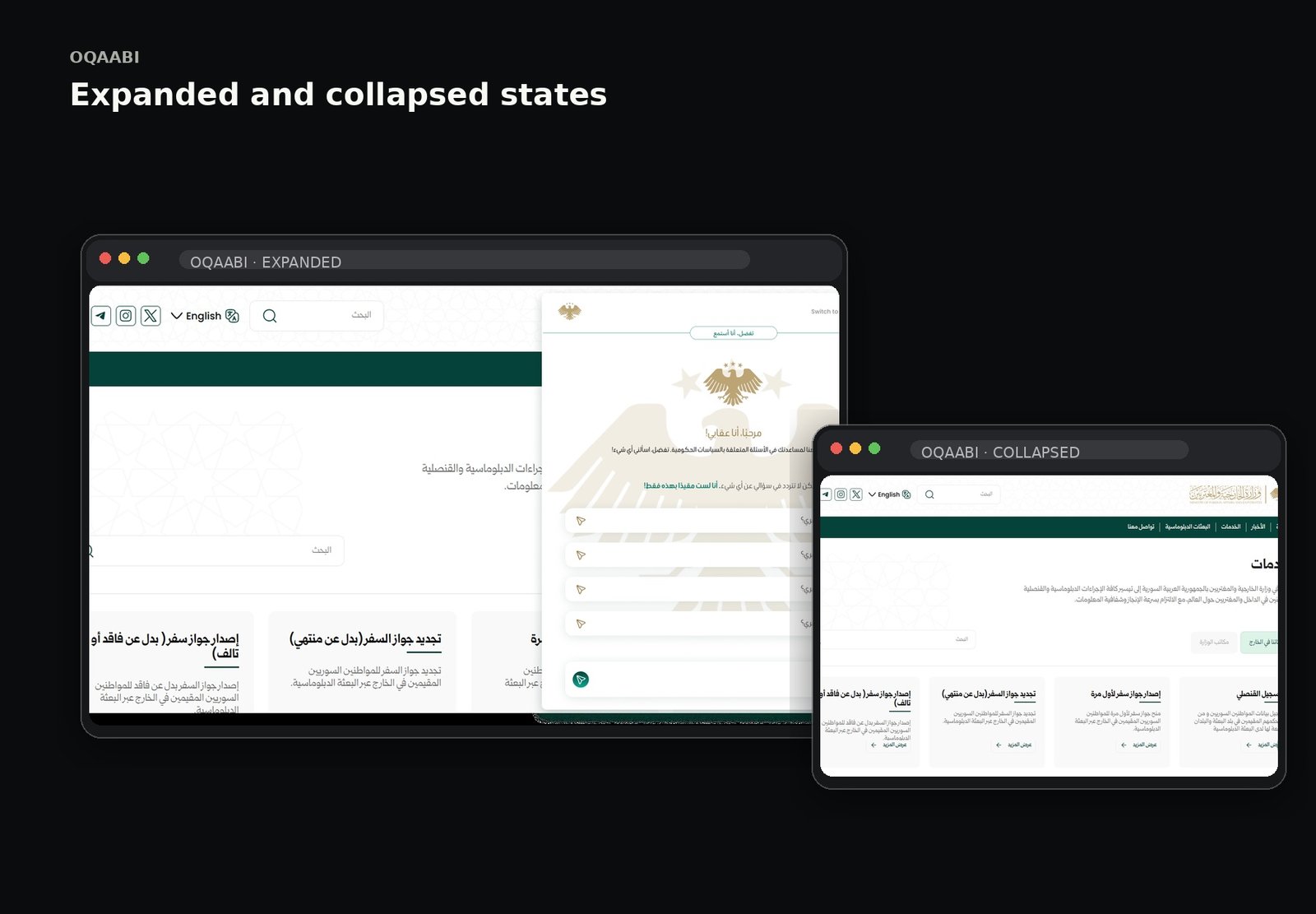
Designing a bilingual AI experience where language, directionality and conversation stay calm even as the system becomes powerful.
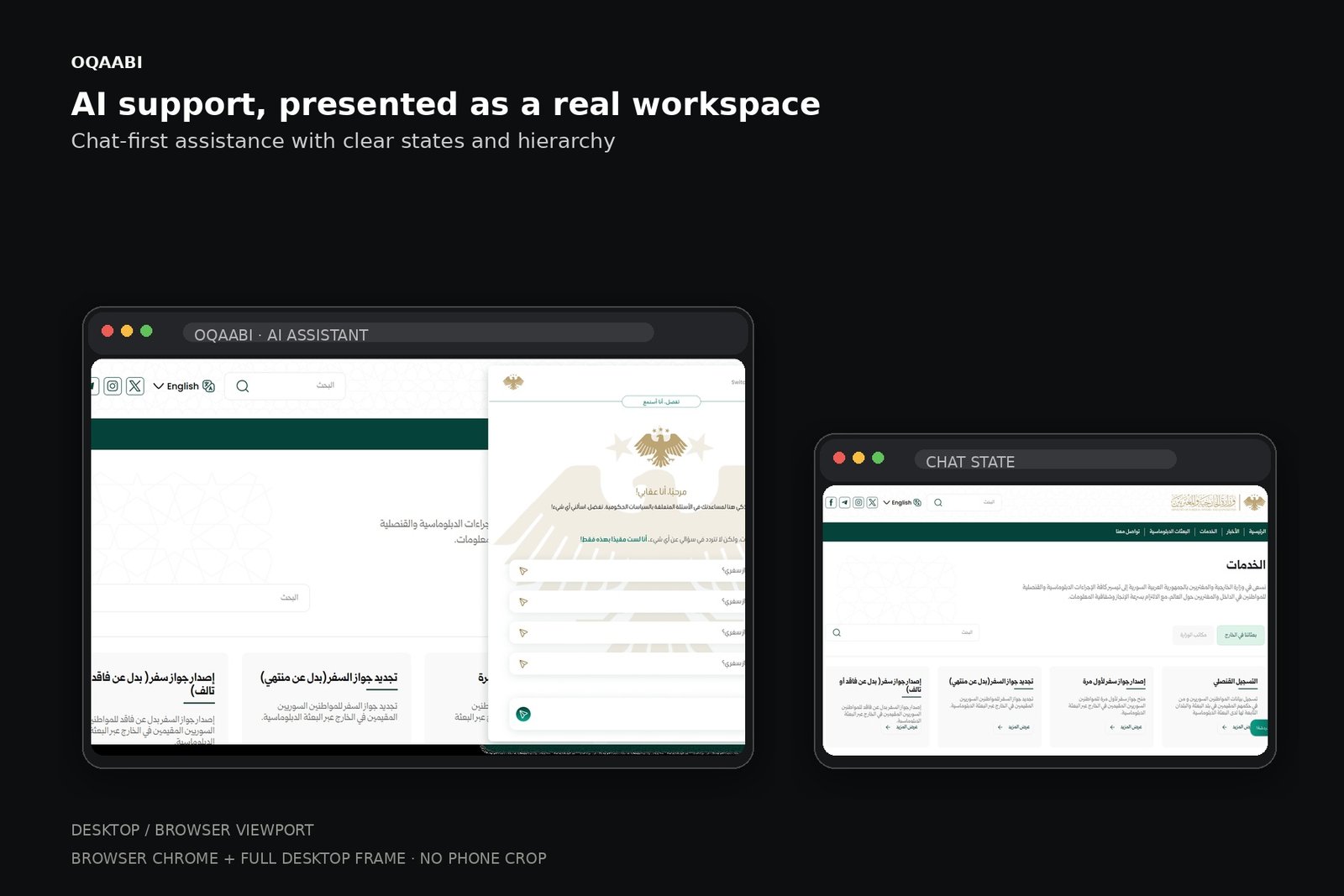
The supplied Oqaabi UI is presented as a browser-first AI experience with the original interface kept intact.
Oqaabi is presented as a bilingual AI experience. The design problem expands beyond translation: users should feel that both language modes are equally intentional, readable and complete.
Before shaping the interface, the work is framed around the user's mental model, moments of friction and the opportunities that can change the journey.
Language changes reading direction, density and scanning behavior—not just words.
Long AI answers need strong visual anchors and progressive disclosure.
Users need an easy way to continue, refine or switch language.
RTL/LTR inconsistency
Long responses become visually heavy
Language controls compete with the conversation
Design bilingual parity into the component system
Create response anatomy with scan points
Keep language state visible but quiet
The interface follows a clear information hierarchy so visual polish supports the product model rather than hiding it.
If language choice is treated as a product state—not a utility toggle—and the conversation model is designed for both LTR and RTL from the start, the experience can remain coherent without making the interface feel technical.
The journey is intentionally expressed as a sequence of decisions, not a list of screens. This keeps the case study about behavior and product thinking.
Map language-sensitive moments and identify where direction, content length or terminology could change the experience.
Define a conversation structure that supports short answers, long-form responses, follow-up prompts and system states.
Build mobile screens with strong rhythm, readable response blocks and obvious affordances for continuation.
Stress-test long strings, mixed-language content and edge cases so the visual system remains stable.
These are the decisions that make the final interface feel coherent rather than merely polished.
Design the layout for RTL from day one instead of mirroring at the end.
Keep assistant and user messages visually distinct without over-decorating them.
Use a persistent but quiet language control.
Give long answers breathing room and clear scan points.
Instead of designing each screen independently, repeated behavior becomes a system. That gives future screens the same rhythm and makes implementation more predictable.
Specific business metrics were not available in the supplied portfolio material, so none are claimed.