01HOME / DISCOVERY↗
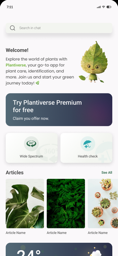
A mobile plant-care experience that brings discovery, care routines, personal spaces and premium moments into one calm flow.
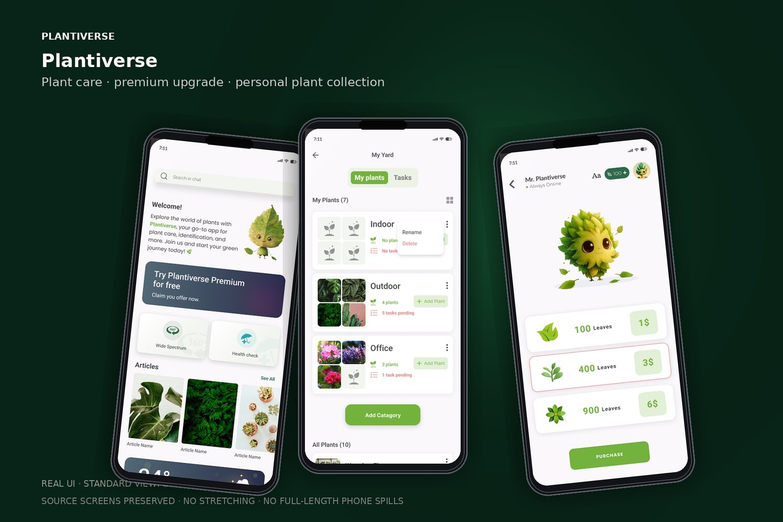
A standard phone viewport keeps each mobile state readable and avoids stretching long source screens inside a device.
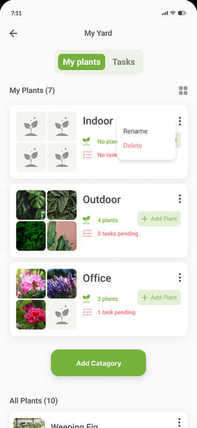
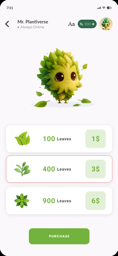
Plantiverse is represented in the supplied design material through a home experience, plant-care content, a personal “My Yard” area, settings, referral and premium purchase states.
Before shaping the interface, the work is framed around the user's mental model, moments of friction and the opportunities that can change the journey.
The home screen needs to establish value immediately.
Personal plant context gives the experience a reason to return.
Premium and purchase states should feel like a natural continuation of the product rather than interruptions.
Disconnected feature moments
Unclear relationship between discovery and personal collection
Purchase states can interrupt the care journey
Create a stronger home-to-plant relationship
Make personal collection states feel central
Keep premium actions visually clear and trustworthy
The interface follows a clear information hierarchy so visual polish supports the product model rather than hiding it.
If discovery, personal plant context and care actions are presented as one connected journey, the product can feel useful every time the user opens it rather than only when they need a specific feature.
The journey is intentionally expressed as a sequence of decisions, not a list of screens. This keeps the case study about behavior and product thinking.
Frame the experience around the moments that make plant care useful: discovery, understanding and returning to a personal collection.
Create a relationship between individual plant content and the user’s own space.
Design premium and purchase states so the transition feels intentional and visually consistent.
Bring the product together with a calm visual language, clear cards and consistent mobile behavior.
These are the decisions that make the final interface feel coherent rather than merely polished.
Keep the home experience visually calm and content-led.
Treat the personal collection as a primary destination, not a secondary utility.
Separate product value from the mechanics of purchasing.
Use consistent card and action patterns across care and premium states.
Instead of designing each screen independently, repeated behavior becomes a system. That gives future screens the same rhythm and makes implementation more predictable.
Narrative is based on the supplied Plantiverse design screens; no engagement or revenue metrics are claimed.