01HOME↗
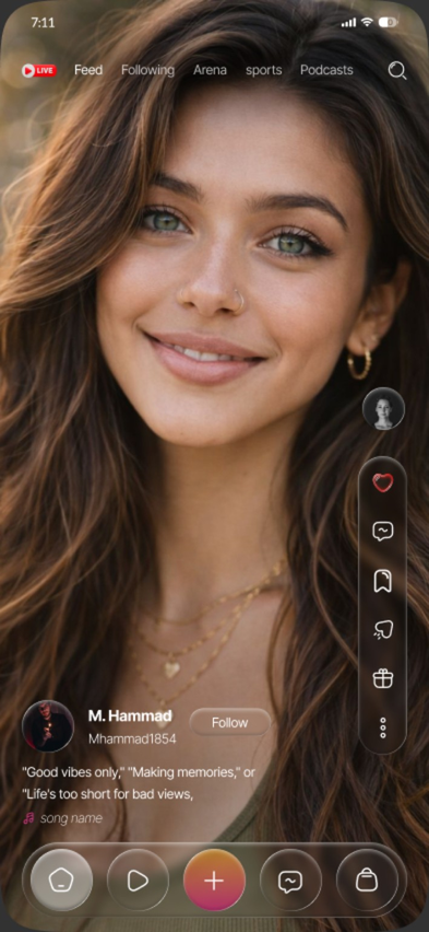
A visual direction for a social product spanning home, following, live shopping and chat while keeping the experience editorial and focused.
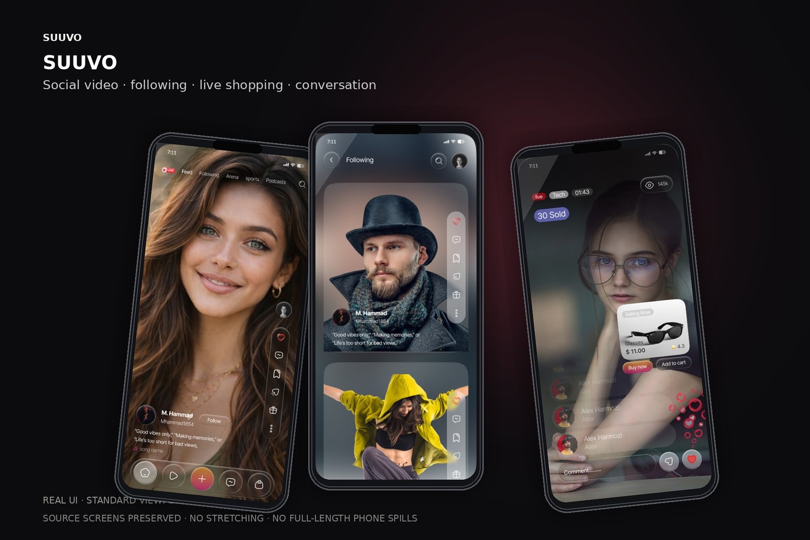
The approved editorial direction is shown through the real Home, Following and Live Shop states at phone-safe proportions.
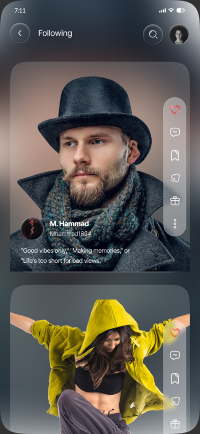
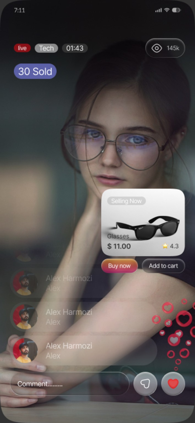
The supplied SUUVO material covers four core moments: Home, Following, Live Shop and Chat. The visual direction uses a dark editorial surface, restrained labels, soft glow and focused content presentation.
Before shaping the interface, the work is framed around the user's mental model, moments of friction and the opportunities that can change the journey.
Content needs to remain the visual hero.
Mode changes should feel distinct without looking like separate products.
Live and chat states need stronger interaction affordances than passive feed content.
Competing content priorities
Mode switching can feel abrupt
Commerce and conversation can overwhelm the content layer
Use editorial hierarchy to control attention
Create a shared visual language across modes
Give live and chat actions clear but restrained prominence
The interface follows a clear information hierarchy so visual polish supports the product model rather than hiding it.
If each mode has a clear visual role while sharing one underlying design language, users can move between discovery, live commerce and conversation without losing context.
The journey is intentionally expressed as a sequence of decisions, not a list of screens. This keeps the case study about behavior and product thinking.
Separate the product into the moments that need different interaction intensity while keeping the visual system shared.
Build an editorial rhythm that lets the primary content dominate while secondary actions remain discoverable.
Design live and chat as natural extensions of the content experience instead of isolated utilities.
Use dark surfaces, soft glow and restrained labels to create a premium, immersive visual layer.
These are the decisions that make the final interface feel coherent rather than merely polished.
Let content carry the visual weight.
Keep labels restrained and consistent.
Use glow and motion as orientation cues rather than decoration.
Preserve context when moving from feed to live or chat.
Instead of designing each screen independently, repeated behavior becomes a system. That gives future screens the same rhythm and makes implementation more predictable.
Narrative is based on the supplied SUUVO screens and approved visual direction; no product-performance metrics are claimed.