01HOME / BALANCE↗
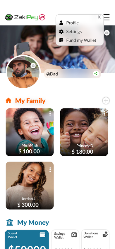
A finance experience focused on trust, clarity and everyday money decisions rather than intimidating financial density.
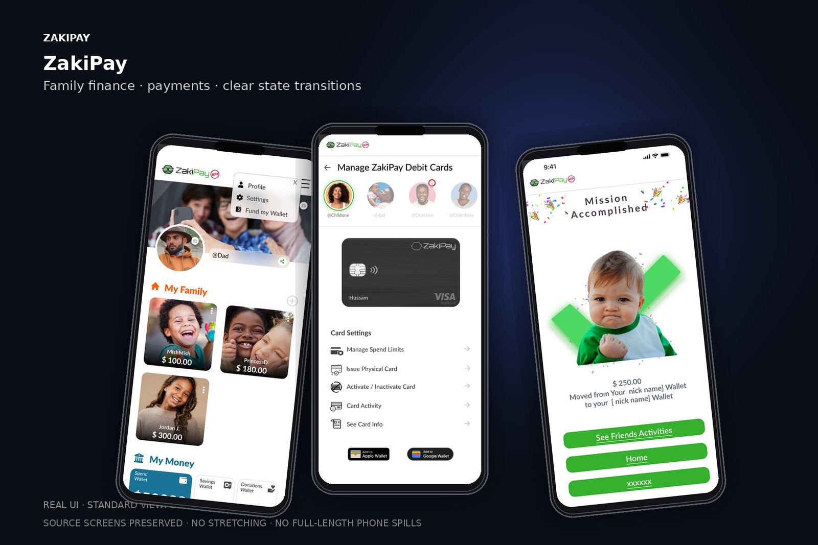
Real product screens presented at a standard mobile viewport — the long source screens are intentionally cropped to what one phone can show.
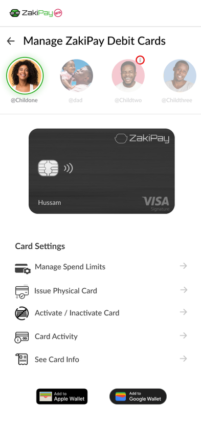
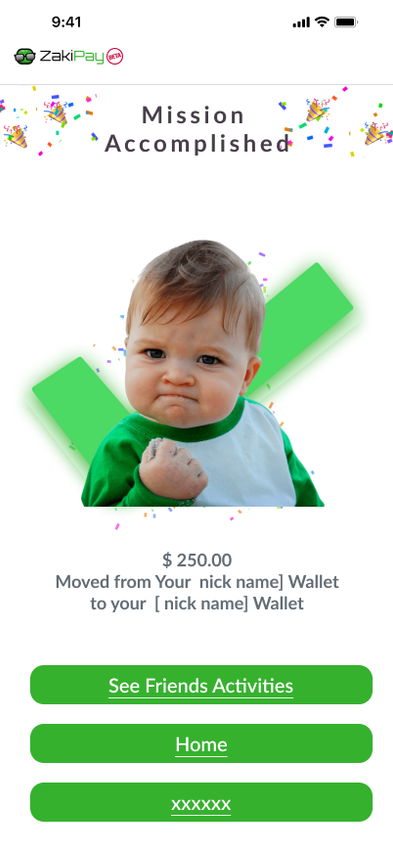
ZakiPay is framed as a consumer fintech experience where money movement, balances and activity need to be understood quickly by people with different levels of financial confidence.
Before shaping the interface, the work is framed around the user's mental model, moments of friction and the opportunities that can change the journey.
Users scan for balance, recipient and status before reading secondary detail.
Financial errors require recovery paths, not only success states.
Confirmation should reduce anxiety instead of adding visual noise.
Equal visual weight across too many numbers
Unclear transaction status
Dense confirmation screens
Center each flow on one decision
Make status and recovery explicit
Use progressive disclosure for transaction metadata
The interface follows a clear information hierarchy so visual polish supports the product model rather than hiding it.
If the interface organizes around decisions and reassurance—what can I do, what changed, and is it safe?—users can complete financial tasks without having to decode the UI first.
The journey is intentionally expressed as a sequence of decisions, not a list of screens. This keeps the case study about behavior and product thinking.
Identify where financial errors feel expensive: recipient selection, amount entry, confirmation and transaction status.
Reduce each primary flow to one clear decision per screen, while preserving access to supporting detail.
Use status, confirmation and transaction patterns that communicate what happened without creating alarm.
Turn money, status and identity patterns into a reusable component language across mobile surfaces.
These are the decisions that make the final interface feel coherent rather than merely polished.
Make amount and recipient the visual anchors of payment confirmation.
Separate success, pending and failed states with language—not color alone.
Keep secondary transaction metadata available but quiet.
Design for recovery: users should understand what to do after an error.
Instead of designing each screen independently, repeated behavior becomes a system. That gives future screens the same rhythm and makes implementation more predictable.
Quantitative outcomes were not available in the supplied project material; metrics are intentionally omitted.